
Webb's Golden Stellar Nursery Has a Red, Messy Secret
Published October 11, 2026
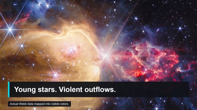
Infrared data mapped into visible colors; not the view a human eye would see.
Photo credit
ngc7129 hero.png
NASA, ESA, CSA, STScI; image processing: Alyssa Pagan (STScI) · STScI/NASA informational-use policySource photograph cropped for a 16:9 layout, editorial headline added; image itself not regenerated. Actual Webb data mapped into visible colors.
Resized for display; composition unchanged.
NGC 7129 is a spectacular new Webb image, but the color contrast tells a physical story about young stars, hydrogen, and outflows.
The gold catches your eye first. Then the red patch at the right starts to look less like decoration and more like a place where something is happening.
Webb's October 6 release shows NGC 7129, a star-forming region roughly 3,300 light-years away. The image brings together stars at different stages, dense material, and outflows from growing protostars. Its contrast is a clue to the region's physics, not just an attractive color treatment. Image and release data.
NASA identifies hot atomic hydrogen in the golden region and cooler molecular hydrogen toward the red, clumpier region. Outflows from embedded protostars shock and heat parts of that material. The coldest dense gas is mapped in gray.
The Colors Are Assigned, but the Evidence Is Real
Webb observes infrared wavelengths. To make an image readers can see, processors assign visible colors to the observations through different filters. That does not make the structures fictional. It means the picture is a translation of data rather than a literal human-eye view.
The distinction is worth keeping. Calling it "false color" can make an image sound arbitrary, while calling it simply a photograph can hide how much information the choices carry. The useful question is which wavelengths and features each assigned color represents.
The NASA asset page lists the filters and color mapping. It also distinguishes the observation date, December 17, 2025, from the public image release on October 6, 2026. This week's news is the released view and explanation, not a claim that the telescope made the observation this week.
What Changes When the View Gets Sharper?
The comparison with Spitzer is particularly helpful. A feature that looks like a broad glowing area in one image resolves into filaments, stars, and structured gas in the other. The region has not transformed between the two panels in the way an ordinary before-and-after photograph might suggest. The instruments and the data presentation differ.
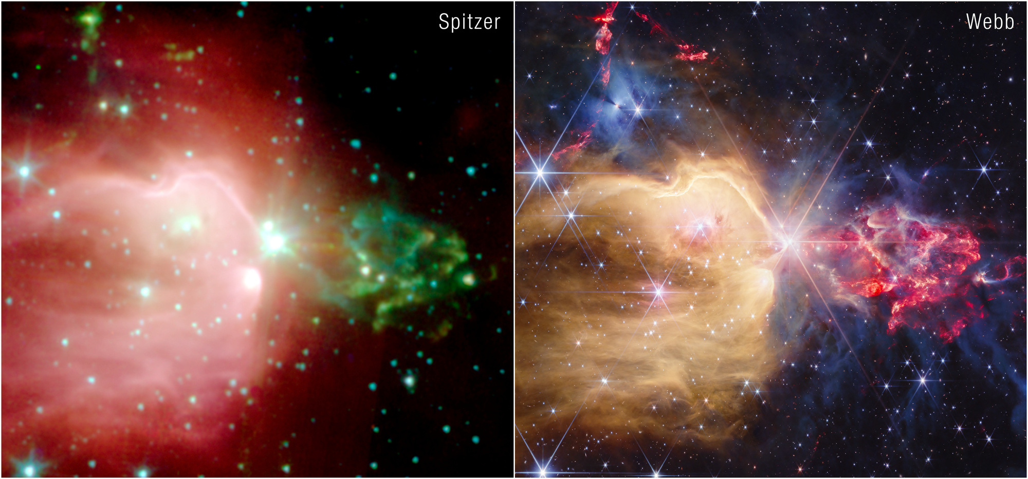
Photo credit
ngc7129 comparison
NASA, ESA, CSA, STScI; image processing: Alyssa Pagan (STScI) · STScI/NASA informational-use policySource image downloaded without semantic alteration; responsive copies resized.
Resized for display; composition unchanged.
That is why image comparisons deserve captions. A sharper result can reveal previously blended sources without showing that new stars suddenly appeared. A different filter can emphasize a feature that was less obvious before without making it newly created.
The Messy Part Is the Interesting Part
The young stars are not simply sitting inside a luminous cloud. They interact with their surroundings. Radiation changes the gas; growing protostars expel material; dense regions can conceal objects while nearby outflows mark activity.
The image's beauty is inseparable from that unevenness. Smooth, uniform color would be less informative. The clumps, cavities, and narrow features give the eye places to stop and the science something to explain.
For anyone who makes images, there is a useful lesson here: explanatory color can attract attention without inventing a spectacle. It works best when the viewer can discover what the color means after the first glance.
Which part of the image pulled you in first, the golden cavity or the red outflows? Tell us what you noticed in the comments below.
Comments
Member comments are temporarily unavailable.
Log in to join the discussion.